Roles & Services:
Graphic Design, Illustration, Package Design, Photo Re-Touching, Product Design,
Copywriting, Re-Branding, Creative Direction.
Copywriting, Re-Branding, Creative Direction.
Breathing New Life into an old product line
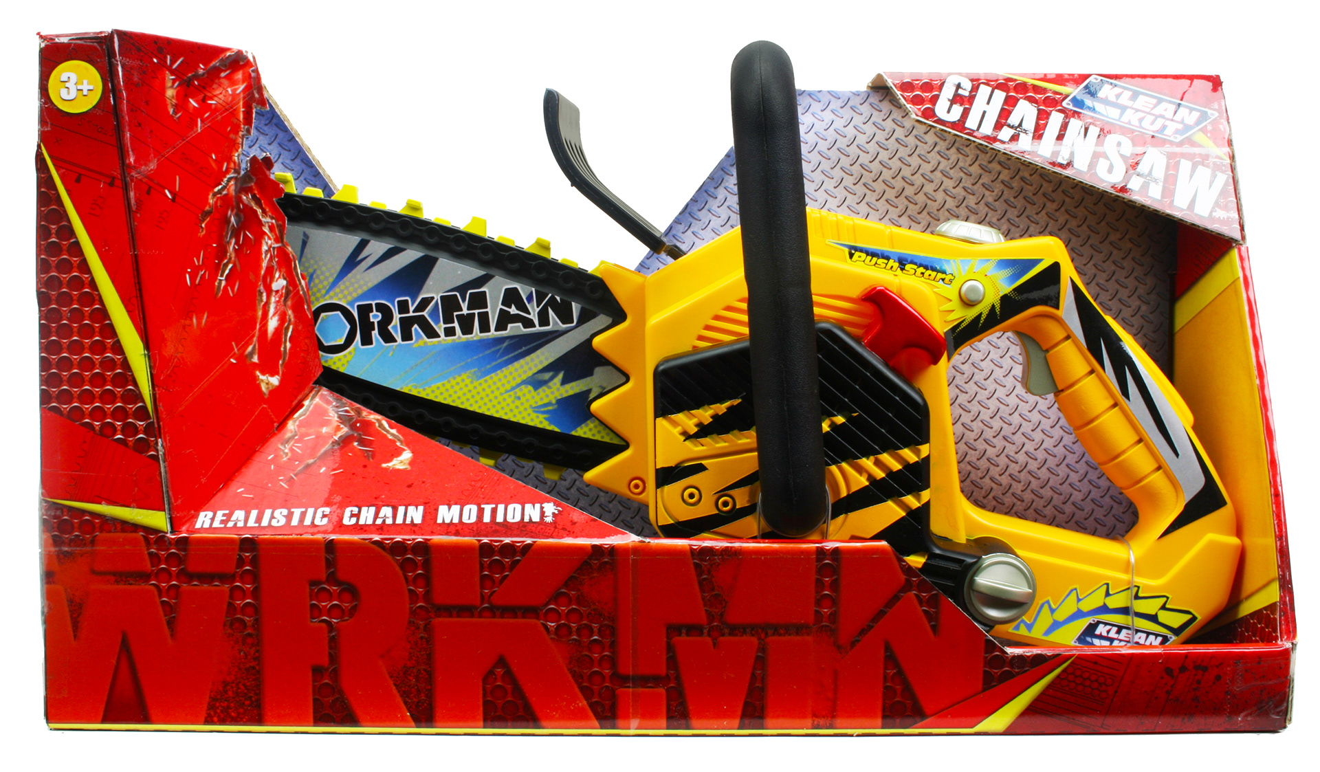
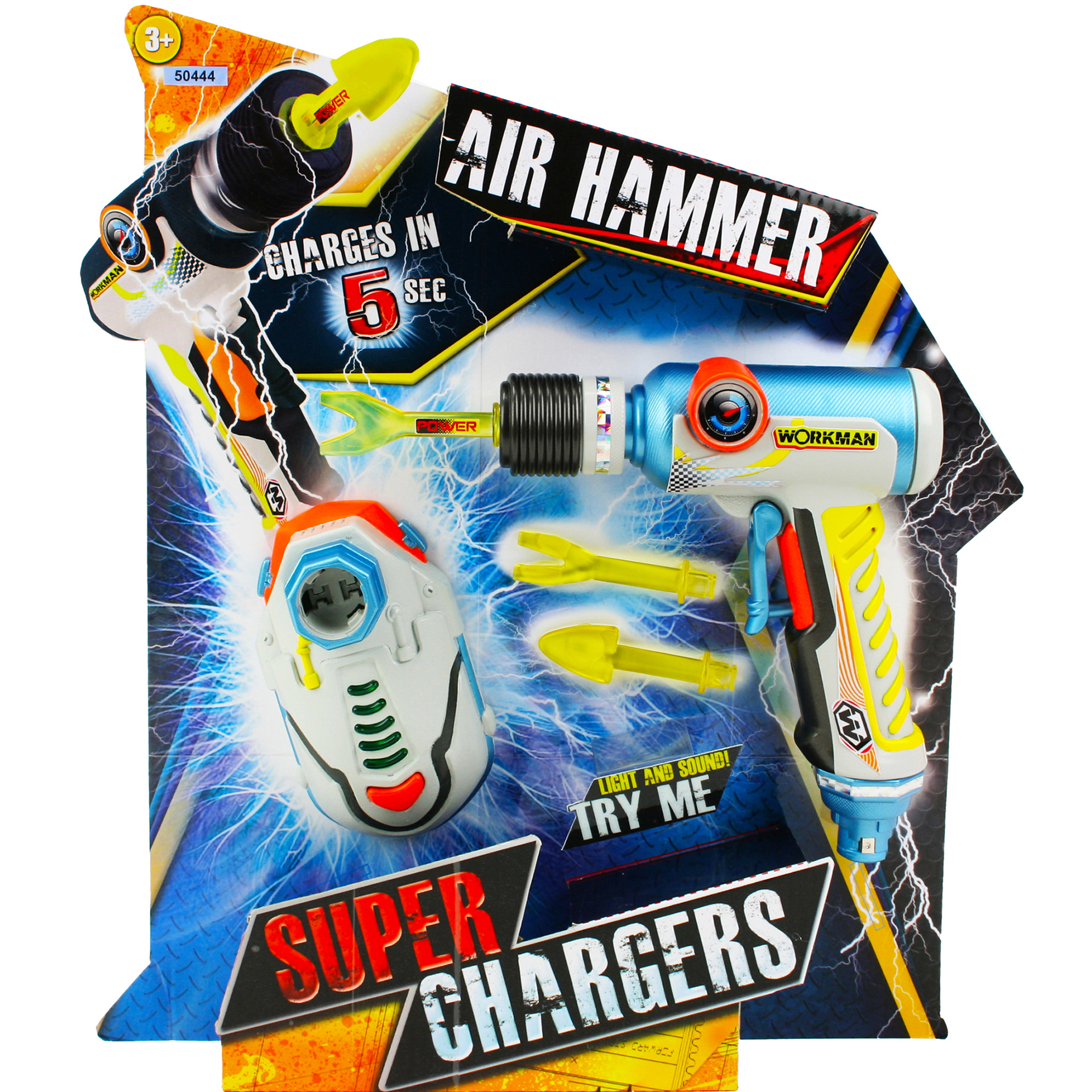
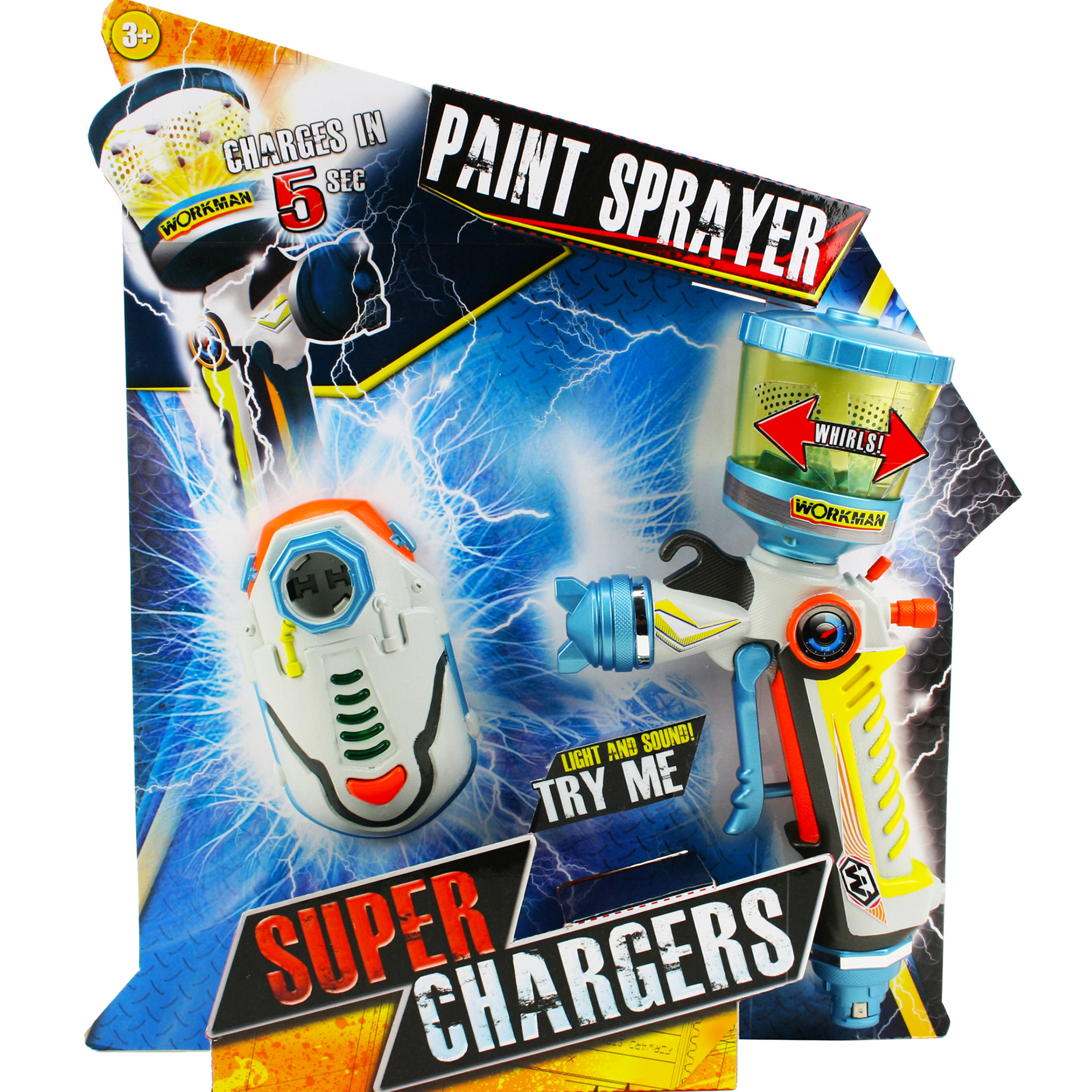
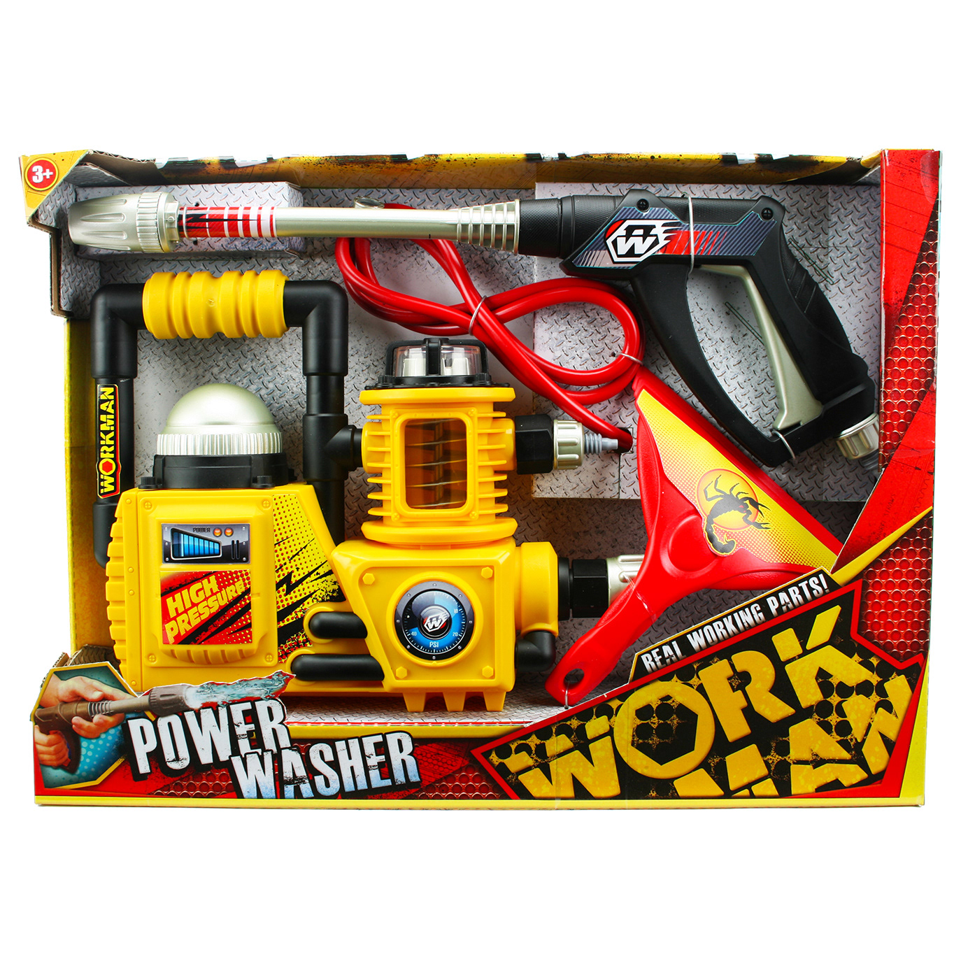
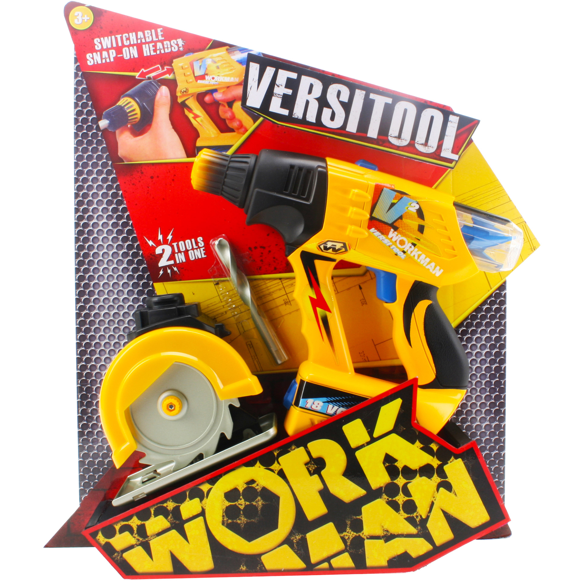
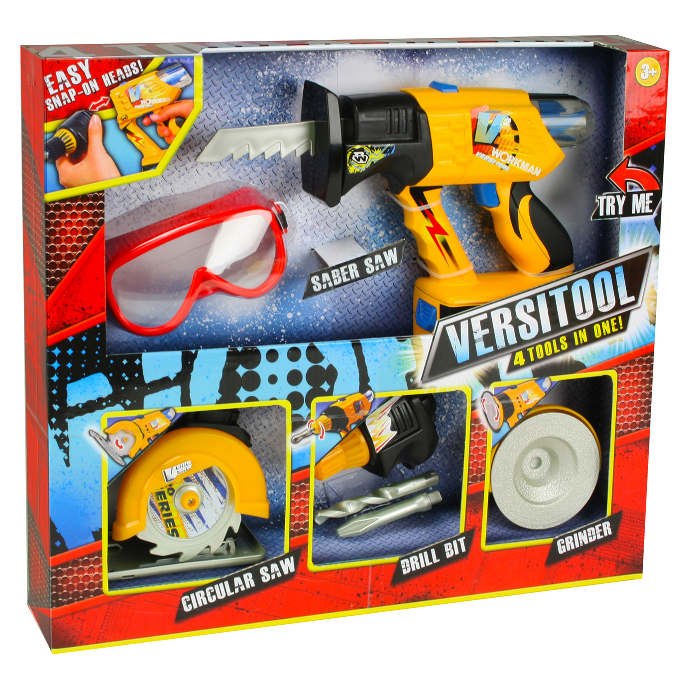
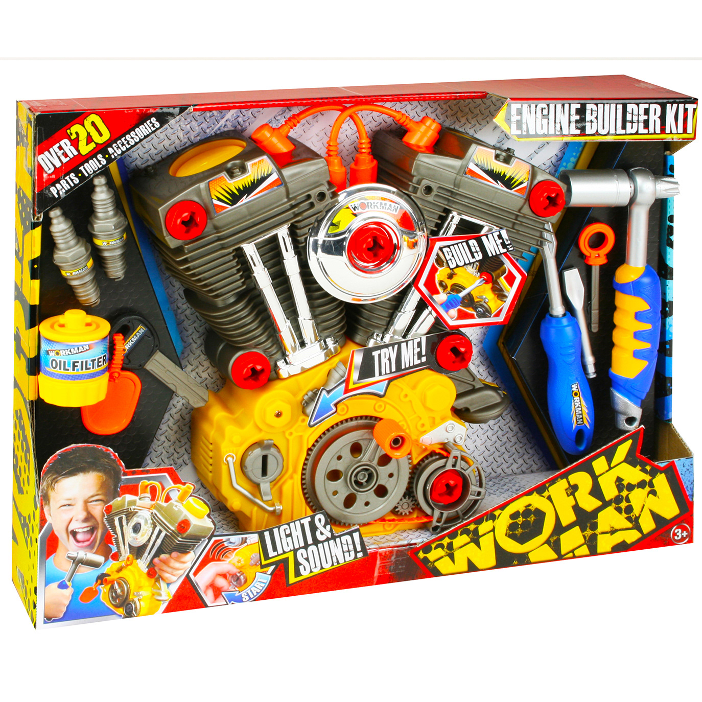
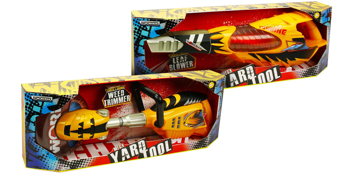
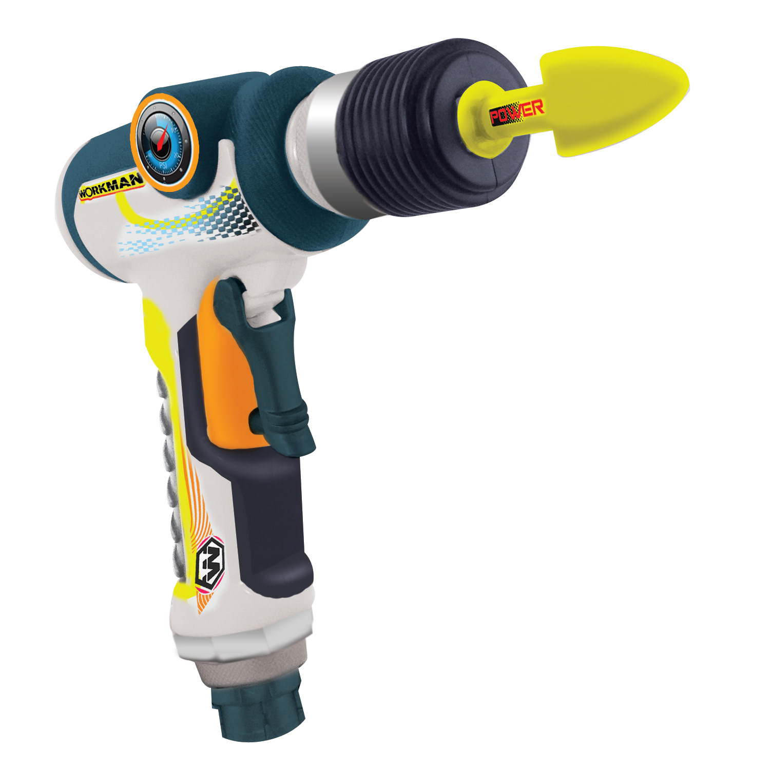
Lanard Toys gave me the chance to refresh one of their top-selling products, the Workman Powertool line. It was a challenging project, but it became one of my favorites. I had a lot of creative freedom and explored several different directions for the Workman brand before landing on the final look you see below.


art direction & Strategy
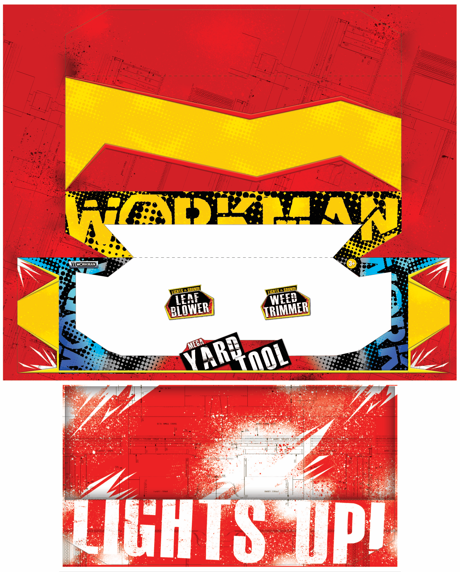
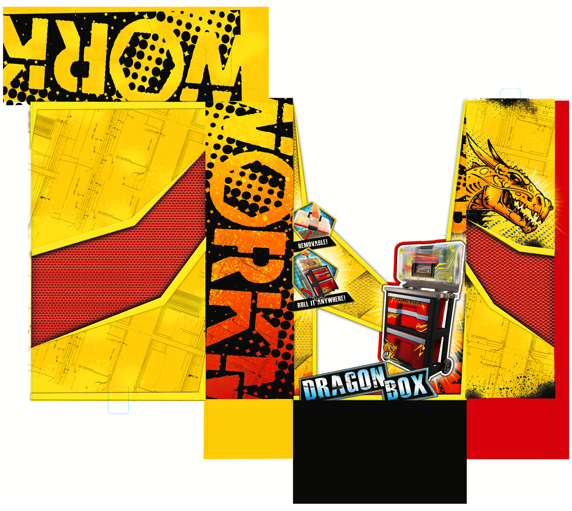
The big challenge was taking a plain, outdated look, and making it feel fresh and appealing for today’s market. I went for an unconventional approach, experimenting with more dynamic ways to package the product. Instead of sticking with traditional box shapes, I introduced angular designs, creating a sense of movement with the box and artwork, then added textures to the graphics. This gave the packaging a bold new look, which helped the updated Workman line once again get put onto major retail shelves worldwide.

endless MOCK-UPS & Photo Re-Touching
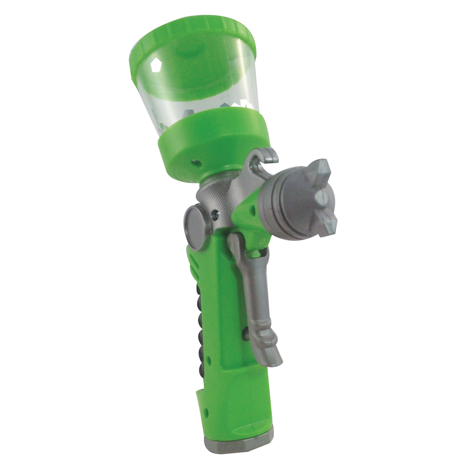
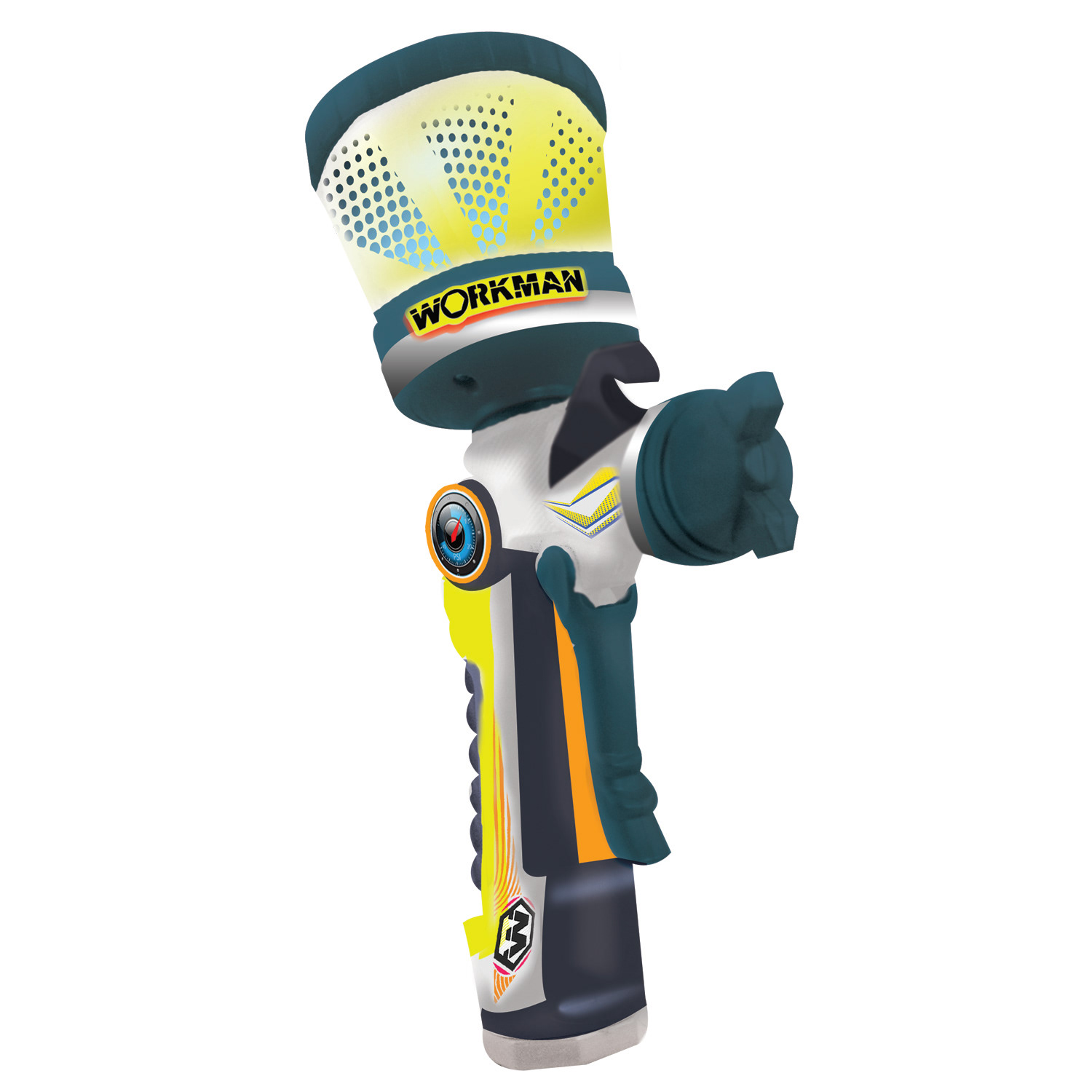
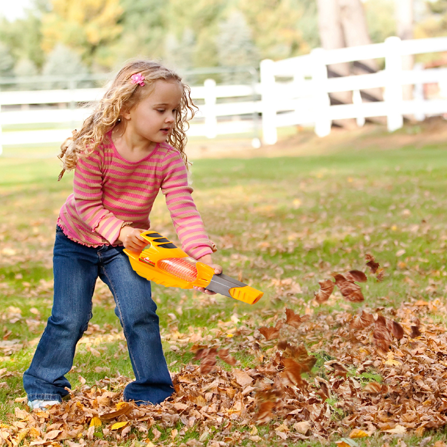
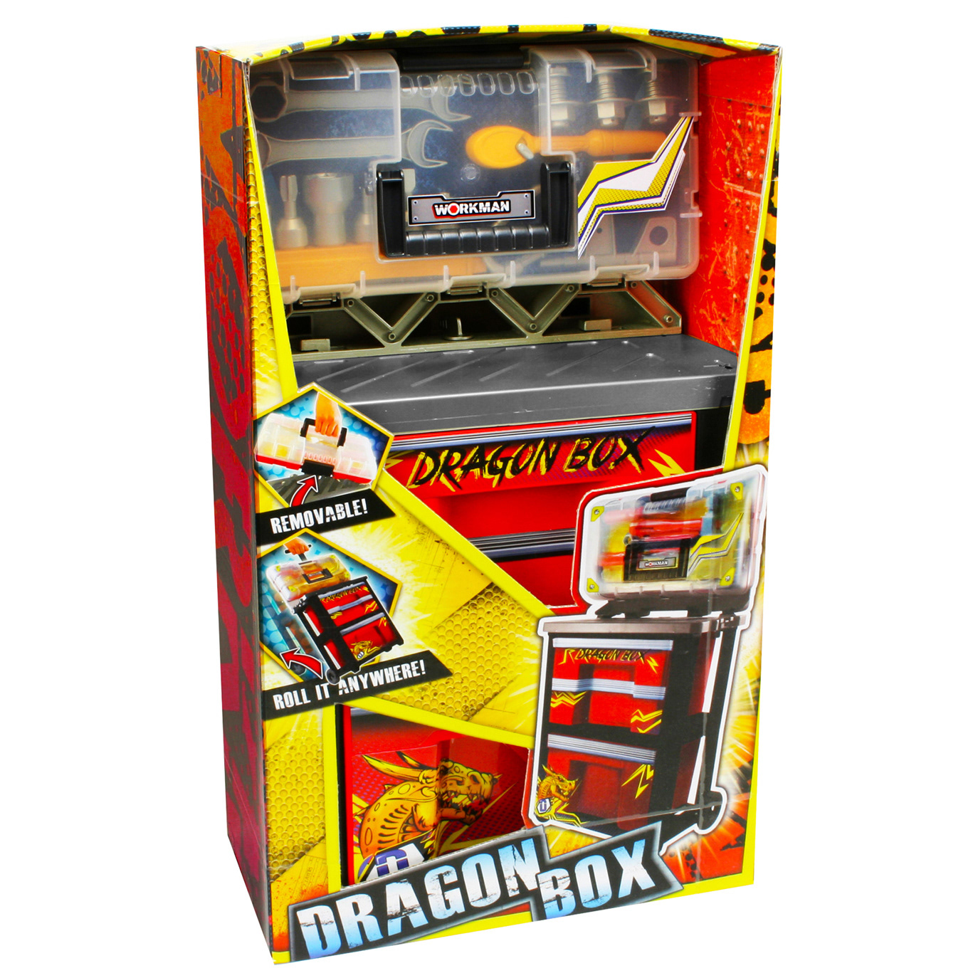
For almost every project, we had to strip down the old product and create mock-ups for the new look. This involved removing the old sticker art, taking our own photos, and then digitally retouching them to match the updated designs. When we finally got samples of the updated products, they often arrived damaged, so we had to clean them up digitally –fixing cracks, enhancing colors, and removing blemishes.

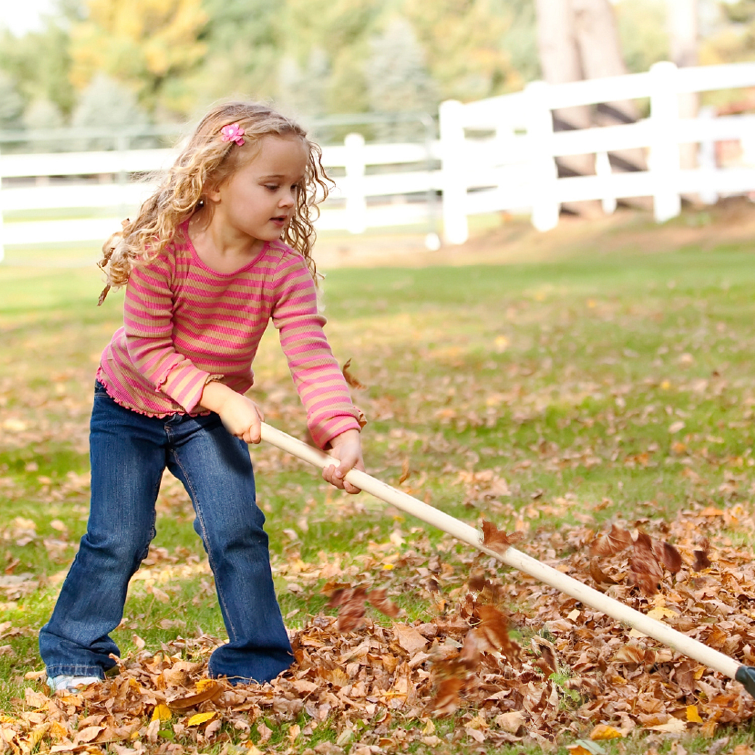
For whatever reason, Lanard Toys never hired models for lifestyle photos, so I had to rely on stock images that matched the current product shot's angles. It wasn’t the most efficient process, and sometimes I’d spend way too much time just searching for a photo with a workable pose or scene. But once I found the perfect shot for my project, the Photoshop magic gets to happen...
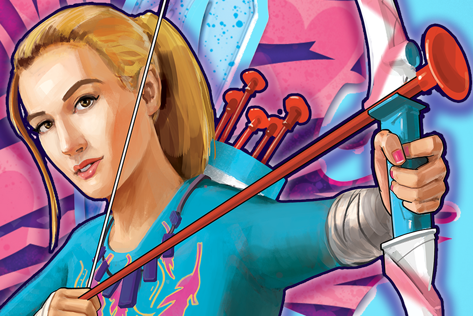
How To Do a PRODUCT Mock-Up
The "Dragon Box" animation below shows my step-by-step process for creating a product mock-up in Photoshop. After stripping down the old product and digitally updating the paint, I add the new sticker art. The goal is to make the mock-ups look as real as possible, paying close attention to lighting, shadows, and how the sticker fits the shape of the product.
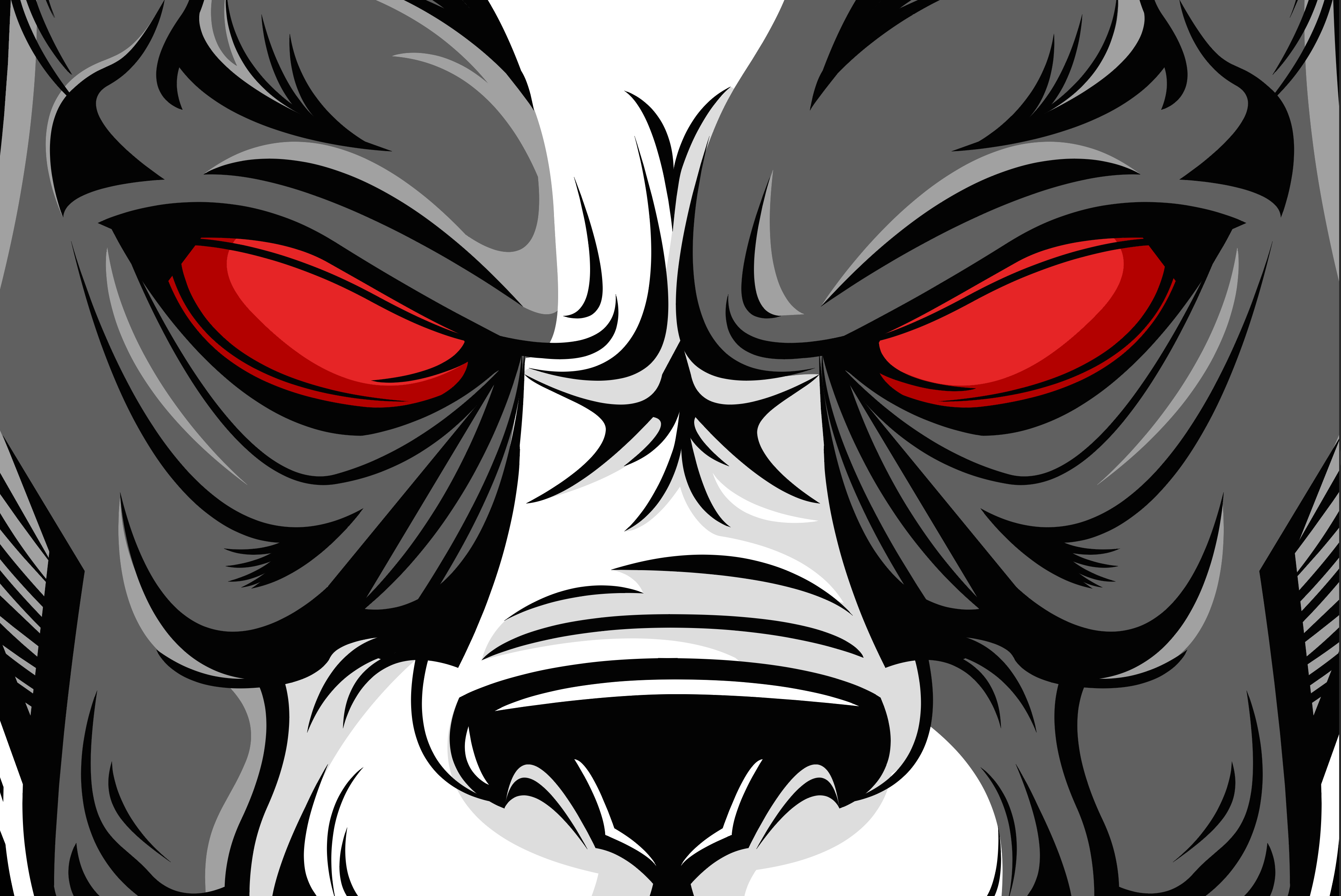
Funny story about the "Dragon Box"... After the initial project meeting with the product developers, I got super excited about incorporating dragon designs into the project. I went all in and came up with the look you see here. It wasn’t until the final presentation that I realized they actually meant "Draggin' Box" – not "Dragon Box"! Despite the mix-up, they loved the design and decided to roll it out to final production as-is. So, "Dragon Box" it was!
Thank You for Viewing this project!
Click Here to See the Other Fun & Playful Lanard Toys Projects I Worked On.