BIOCODEX USA | FLORASTOR PACKAGE REFRESH
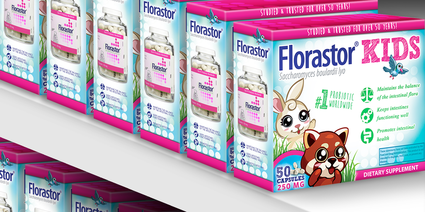
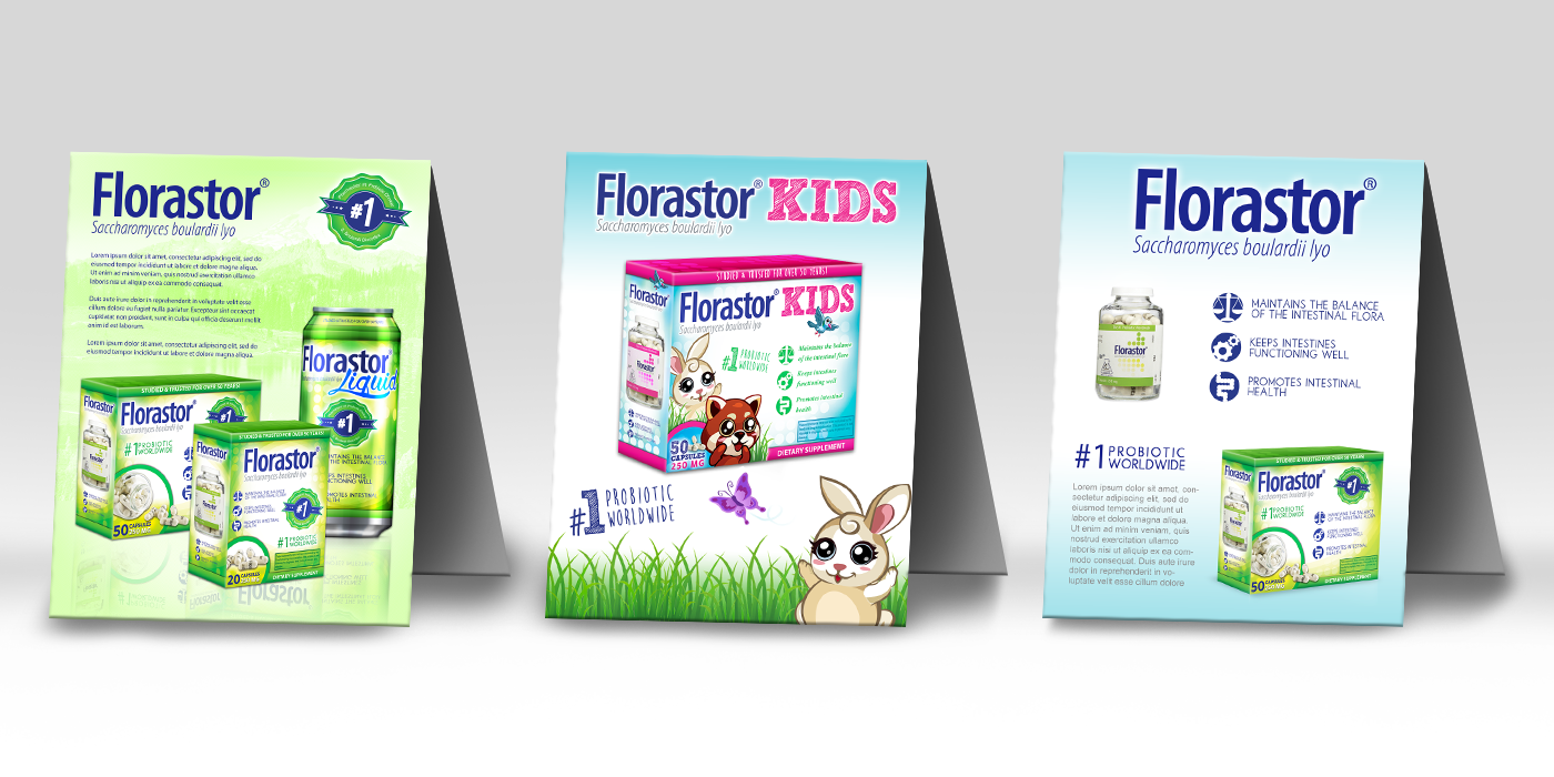
Biocodex USA needed a new feel for their line of probiotic products, FLorastor. They wanted to explore a different concept and direction that would help their products stand out from their competitors. To me, the old Florastor and Florastor Kids packages were a bit plain and I felt there was an opportunity to make the package more vibrant without losing the original package's minimalist style. The end result kept the same feel and colors of the older product packages, but introduced a wider range of colors. New icon styles and more contrasting elements helped keep the information look visually clean and interesting. More kid-friendly colors and cartoon characters were a nice touch for the Florastor Kids box. This was inspired by the children's multivitamins section and cereal aisles at grocery stores. Product Point of Sales cards were also made for retail shelves. Unfortunately, these were never rolled out into production.

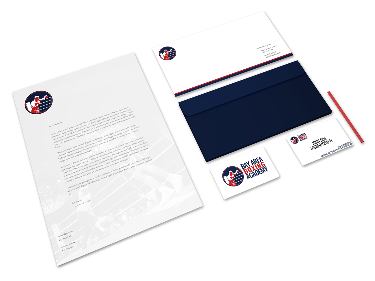
BAY AREA BOXING ACADEMY | MARKETING & BRANDING COLLATERAL

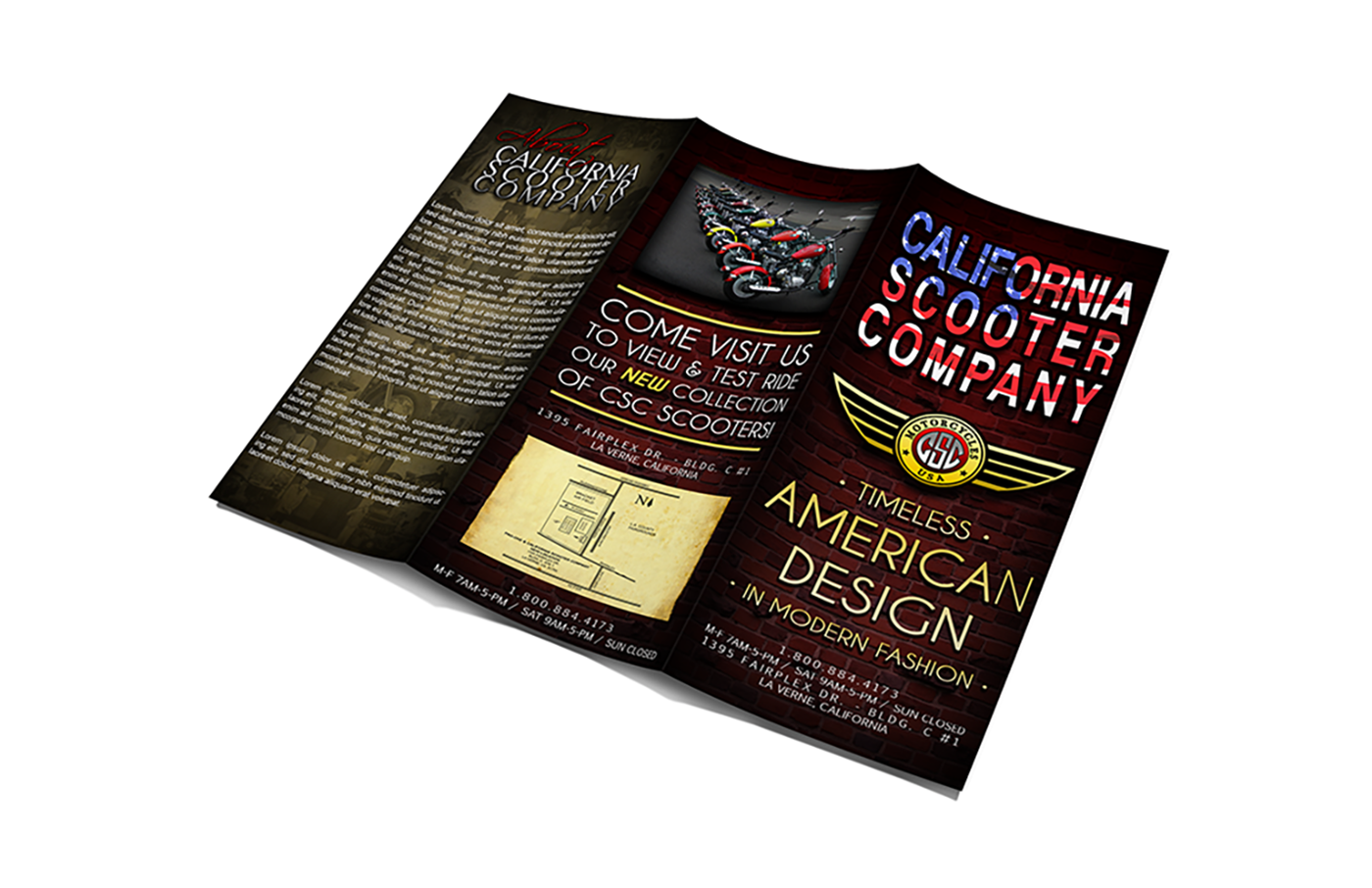
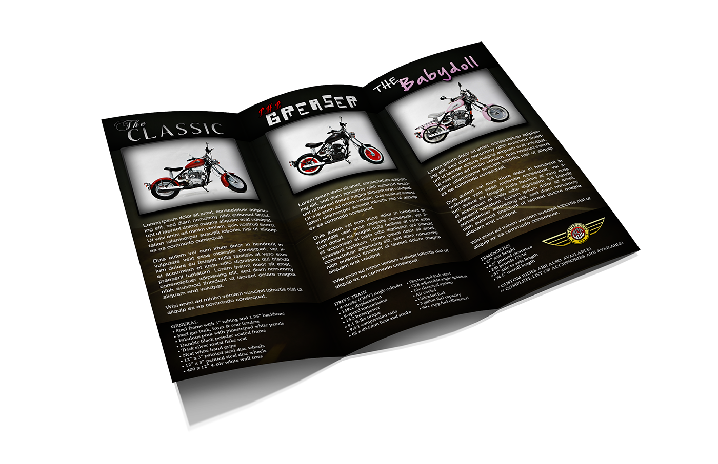
CALIFORNIA SCOOTER COMPANY | RE-DEFINING THE BRAND
California Scooter Company was all about creating that timeless American motorcycle design with modern fashion. Unfortunately, their branding assets did not reflect this. Starting with their logo and brochures, I created a concept and style that paid tribute to the American Motorcycle Heritage.


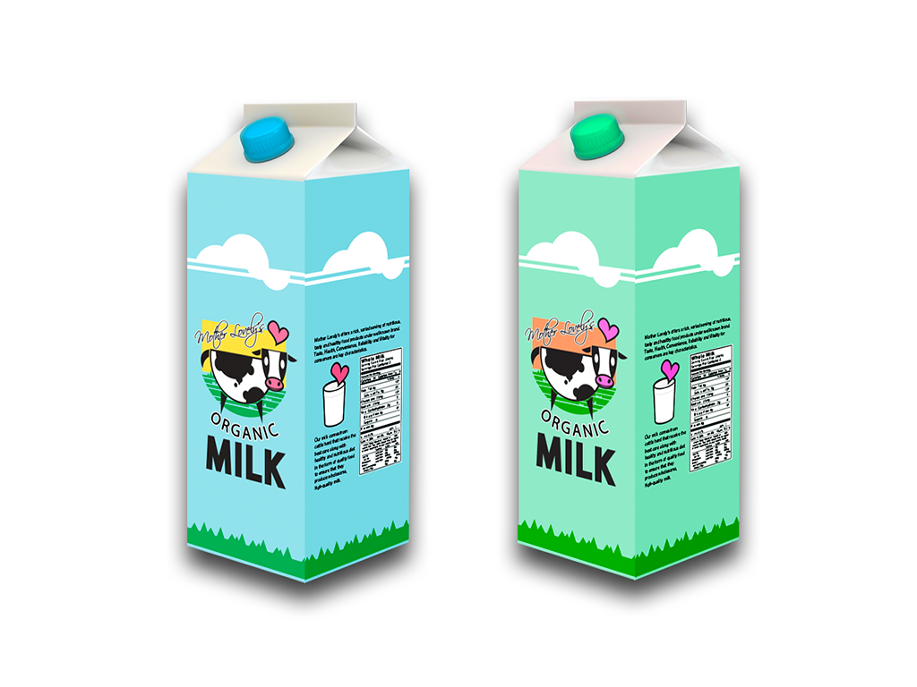
MOTHER LOVELY ORGANIC MILK | PACKAGING CONCEPT
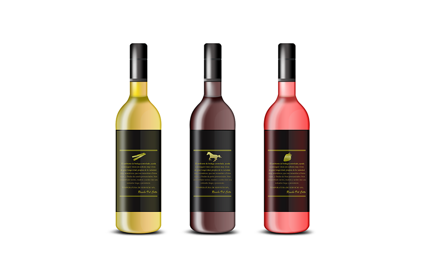
DOS CABALLOS WINE | PRIVATE LABEL PACKAGING CONCEPT